
Table of Contents
“Microinteractions are an exercise in restraint, in doing as much as possible with as little as possible.” – Dan Saffer, Microinteractions: Designing with Details (O’Reilly Media, 2013)
When Dan Saffer published Microinteractions: Designing with Details back in 2013, he wasn’t merely adding a random design principle to the UI UX world – he was highlighting a subtle yet impactful concept that shapes the manner in which we view digital products but in ways we could never imagine. Today’s world works on speed and functionality, and small moments of reassurance stand out and make all the difference in influencing user experience. These are essentially microinteractions.
In healthcare apps, these minute wonders matter more than ever. Think about it – are they just about scheduling appointments and accessing lab test results? The answer is an easy no – an individual’s health journey is often personal and emotional, and in times like these, mobile app development firms cannot be callous and cold. They need to be strategic but also empathetic by carefully incorporating these nuanced elements in app design.
Our mobile app development services are based on the concept of microinteractions in every aspect of creation. This blog delves into the ins and outs of how little things matter the most. We dig deep into how they foster patient trust and engagement in the long run, and how thoughtful UI/UX design services can elevate your healthcare app from functional to phenomenal.
MICROINTERACTIONS: WHEN SMALL IS GREAT
These are tiny feedback loops that enhance user experience. To be precise, these can include:
1. A green progress bar that gradually fills as you complete each step for medical document uploading
2. A tactile vibration that alerts the user when they’ve inserted the wrong password
3. A calming sound or a green tick mark symbolizing a successful transaction or payment booking
All of these examples seemed pretty trivial and insignificant, didn’t they? Rather, they subtly guide patients while using the app by giving them the right cues and signals at appropriate situations. This, in turn, enhances customer satisfaction and overall usability.
Even data proves that these are more than just nice-to-haves.
| DID YOU KNOW? Around 70% of users say they’re more likely to stay engaged with an app that feels intuitive and gives timely feedback, as per a UXPin study. |
WHY DO MICROINTERACTIONS MATTER IN HEALTHCARE?
Microinteractions serve a mindful purpose in patients’ lives. When mobile application development firms create healthcare apps, they must remember that their target audience comprises a group of people dealing with health concerns or battling stress or anxiety. Therefore, frictionless app navigation is instrumental in building trust with the company.
Despite being ‘small’, the impact of these wonders is huge. Here are a few reasons why they are a critical component of UI design:
1. Emotional Connection
Picture a patient just completing their health goal for the day. However, he is met by a confirmatory message saying ‘Daily goal completed’. Not engaging enough? Well, an appropriate microinteraction in this case could include a jolly emoticon or a subtly positive-looking animation. When you’re frustrated with prolonged waiting times, a calming loader can put your mind at ease and relax those frayed nerves. Thus, microinteractions establish strong emotional connections with users by tying usability to empathy.
| DID YOU KNOW? Apps that utilized human-like responses in user testing showed a 2.4x increase in emotional engagement, according to Adobe’s UX Trends Report. |
2. Facilitated Usability
The core principles of any successful app are usability and functionality. When users get immediate feedback on their actions, they feel compelled to interact with it even more. For instance, seeing a simple ‘tick mark’ at a successful step makes one feel reassured that their data has been recorded successfully.
| DID YOU KNOW? In a usability testing by Nielsen Norman Group, users completed onboarding 45% when guided with subtle visual cues versus apps without them. |
3. Clear Communicator
Patients using healthcare apps understand layman’s terms and not complex medical jargon. The careful utilization of microinteractions facilitates the conveyance of clarified and simplified messages. For example, to warn patients of the risk of overdosage of certain medications, a red exclamation mark does the trick and gets the message across without ever needing to use a single word.
| DID YOU KNOW? According to NNGroup, a microinteraction improves task success rates by up to 40% by reducing uncertainty through instant feedback. |
4. Heightened Trust and Engagement
App responsiveness equates to professionalism, attention to detail, and intuitive design. Platforms that react to a user’s input with small animations or subtle feedback with situation-dependent visuals or motion graphics are ones that strengthen instilled user trust in healthcare.
| DID YOU KNOW? Google’s Material Design Team deduced that users rate apps as more trustworthy when they incorporate predictable, responsive mini elements – such as subtle animations after button taps or swipe confirmations. |
HOW MICROINTERACTIONS IMPACT BUSINESS
Essentially, microinteractions are more than simple UI animations; they are strategic business tools in disguise. With thoughtful implementation, the way users view and interact with your products is significantly influenced. Below are some examples of how they translate into business value:
1. Surging User Engagement and Retention
As per a report by Localytics, users who have a positive first experience with an app are 4x more likely to continue using it. The use of microinteractions like smooth transitions, animated feedback, or visual cues makes your app’s first impression an engaging one, building intuitive flows that make users come back for more. In a field like healthcare, this is particularly important as patients cannot be overwhelmed by strong and intensive visuals, but at the same time, should not have a boring experience while interacting with the platform. This assures boosting levels of app usage and long-term loyalty.
2. Conversion Boosts
Did you know that even a one-second delay in response time can reduce conversions by 7% (Akamai, 2020)? With subtle design feedback, users become dedicated members of the app through tasks like sign-ups, bookings, or purchases.
3. Reduced User Frustration and Support Costs
Well-designed microinteractions reduce confusion. How? By providing appropriate visual cues, users understand what is happening in real-time. Small animations or transitions can convey the right message, directly lowering customer support queries and technical complaints.
4. Competitive Edge
With our mobile app development tools, healthcare apps tend to showcase both functionality and finesse. A platform that feels better by being more responsive, intuitive, and empathetic is the one that ultimately stands out and makes a mark in the app world. So, if you want yours to be used and not forgotten, then making microinteractions a utility is the way to go.
5. Higher app ratings
With enhanced user experience and customer satisfaction, the microinteraction concept yields higher app ratings and skyrocketing success of companies. Consequently, higher app ratings directly influence downloads, trust, and even partnerships with hospitals and insurers.
According to a study published in the International Journal of Human-Computer Studies, apps offering immediate visual or auditory feedback during interactions had a 27% higher likelihood of receiving 4+ star reviews compared to those with static, unresponsive flows. This simply goes to show that positive app ratings boost visibility in app store algorithms, thus making various products more discoverable to new users. Therefore, investing in microinteractions is a smart business move based on strategy rather than being superficial nice-to-haves.
REALISTIC APPLICATIONS IN HEALTHCARE APPS
Knowing how to apply this novel concept is key to bringing out the intended change you wish to see in your health app. Let’s now review some practical examples of how it enhances UX in real scenarios of healthcare:
1. Daily Pill Reminder
Patients are typically on a prescribed medication schedule, often needing to timely abide by it. However, as it is human nature, failing to adhere due to forgetfulness is not uncommon. Now, picture your app incorporating a gentle vibration and a ‘tick’ sound, urging the patient to take their pill. This form of tactile feedback tends to create a positive reinforcement loop to adhere to schedules promptly.
2. Symptom Checker Feedback
When a user inputs symptoms, the app shows a loading animation that emulates a thinking brain. This leads to better tolerance of waiting times by patients, assuring them the time taken indicates that the system is processing the data accurately and waiting for which would yield precise results.
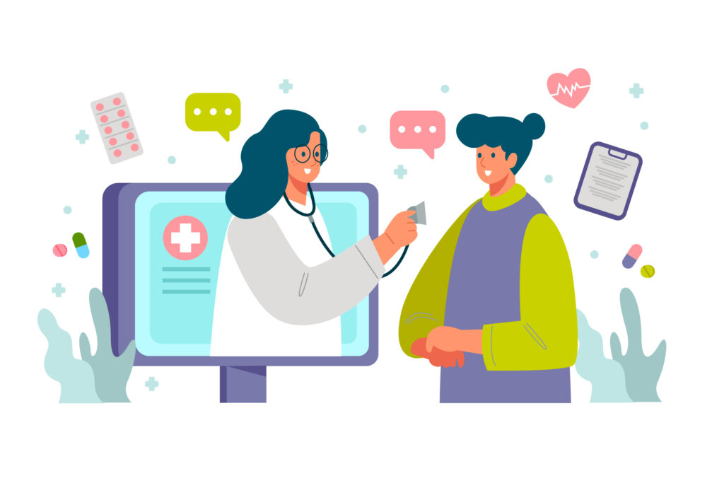
3. Live Chat with Doctors
When patients interact with their physicians in a real-time chat session, the conversation must feel natural and human-like as in an offline setting. Typing indicators and message-read confirmations indicate to either party if the other person is typing or has viewed the message. This creates an engaging feel.
4. Progress Tracker
Making progress in the app is satisfying for audiences, but what creates a better user experience involves the use of visual feedback like a filling circle or a pulsing progress bar. This encourages users to continue tracking health goals.
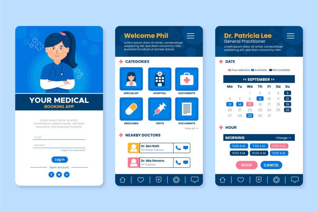
5. Appointment Scheduling
Small touches go a long way in assuring true app functionality. When a user books an appointment, a subtle animation confirming the action such as a soft vibration or a green good-to-go check mark provides clarity on the consequence of the action. This feedback loop prevents duplicate bookings. On a personal note, the user ends up feeling more at ease after this, thus building confidence in the app’s reliability.
6. Biometric Logins
Many healthcare apps utilize Face ID or fingerprint login systems. This is where haptic feedback plays a crucial role. Microinteractions, like a gentle bump when the authentication process is successful, help provide seamless confirmation. For patients with issues with mobility and clarity in vision, this kind of feedback eliminates uncertainty, thus creating a strengthened sense of security.
7. Error Notifications
Imagine a patient trying to update his health profile by filling in missing fields. Any incorrect information entered is flagged by the system through non-intrusive error messages or rather visual elements indicating that an error has been made. This provides immediate and friendly correction to users, reducing cognitive load and frustration, especially for elderly and non-tech-savvy individuals.
OPTIMIZING MICROINTERACTIONS: BEST PRACTICES
Making the best of microinteractions in the healthcare arena in a gamut of UI/UX strategies is a prerequisite to creating a successful virtual health app. Here are some basic, easy-to-follow tips on integrating this concept practically during app development.
1. Keep It Purposeful
They must never be added merely for show. Every animation, tactile, or haptic feedback must carry some meaning and purpose for its usage.
2. Subtlety Is Key
Remember – anything overwhelming is ‘too much’ and the excessive use of anything just brings everything to naught. Patients using the app mustn’t feel anxious, stressed, worried, or burdened with visuals or animations that don’t speak diplomacy in their look or feel. Subtlety is the key to customer satisfaction.
3. Use Sound Sparingly
Sound isn’t a bad thing, but it must be used to limit. In such a case, it must be soft, brief, and skippable.
4. Balance Speed and Visibility
When creating animations to be used in the app, what’s really important is the speed at which you set them to work. Too fast, and they might be missed. Too slow, and they might be exasperating.
5. Performance is Numero-Uno
Lastly, they need to enhance, not slow your app down. Prioritize functionality and performance above all else.
FINAL KEY TAKEAWAYS
In the world of healthcare apps, every second and every interaction matters. The judicious and strategic use of microinteraction is crucial to a health app’s success. These concepts may seem small and trivial. But keep in mind – big things come in small packages. The impact they leave is massive and felt by a diverse range of users. Thus, investing in such thoughtful UI/UX design services is the need of the hour.
Experience an array of health-tech solutions at Naskay Technologies, where innovation meets functionality, precision, and empathy. Our mobile app development services combine cutting-edge technologies with human-centric designs to build healthcare apps that truly make a difference.
Explore our portfolio, read our client stories, or contact us today to discuss how we can help bring your app to life – with all the tiny touches that matter.
Because in healthcare, small things can save lives, and microinteractions can embody that.
FAQs
1. Are microinteractions really necessary in a serious field like healthcare?
Yes – perhaps especially in healthcare. This field deals with patients who are typically anxious or stressed about their health. In times like these, it’s vital to put their minds at ease by humanizing the app’s interface as much as possible and guiding them through various stages like urgently booking appointments, checking test results, and symptoms. This not only brings overall clarity but also makes digital tools seem more responsive and trustworthy, resulting in an elevated user experience.
2. Do they slow down app performance or increase development time?
It depends. If properly implemented, they enhance performance perception and feel lightweight. Else, it might end up slowing the app down. That’s why it’s important to wisely choose a mobile application development company where developers can use modern UI frameworks and native design patterns to keep working as fluid as flowing water.
3. What’s the difference between animation and microinteraction? Aren’t they the same?
Not exactly. Animation typically refers to just movement. On the other hand, a microinteraction is a purposeful, user-triggered moment that is functional and feedback-based, significantly enhancing user experience. However, an animation can help form a microinteraction within an app.
4. What’s a common mistake businesses make with microinteractions in healthcare apps?
It’s the blunder of prioritizing flashiness over functionality. The main purpose of using these UI/UX design tips is to provide clarity and ease-of-use to the user, not be showy. Using them requires a careful balance of judgement and subtlety and is meant to be a ‘gentle guide’ to anyone using the app.
5. I want to build a healthcare app. Where should I begin when it comes to the world of microinteraction?
Begin with core user flows – registration, login, appointment booking, test result views, and medication tracking. Then, pinpoint precise feedback moments where users can be reassured. Work with a design team that understands healthcare UI/UX, and integrate them smoothly and ethically.
Design with precision, empathy, and intent. Ready to enhance user experience with every tap?
Let’s craft healthcare apps that feel human—one microinteraction at a time!