Table of Contents
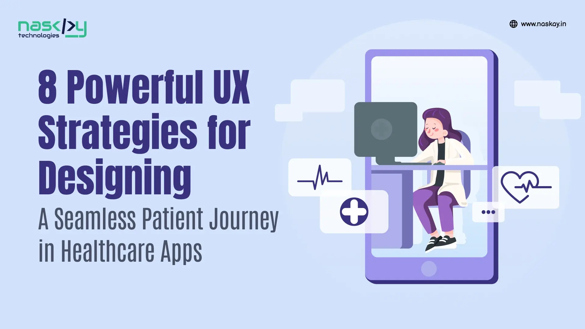
Ever figured out the secrets to a seamless user experience on healthcare apps? Well, that goes beyond just a ‘magical formula’ but rather a set of carefully thought out and meticulously curated business strategies that feels nothing short of natural for your target audience. Believe it or not, a good healthcare app isn’t just about functionality – it’s about how the user feels while utilizing it. That’s where intuitive UX strategies come into play.
Does this leave you at crossroads about where to start when considering UI/UX design? Let it not because this blog will walk you through everything you need to know about designing a healthcare app that not just works but functions seamlessly. We’ll explore how patient journey mapping, intuitive UI, and thoughtful UX design can work wonders in creating an app ‘for the people’. If you’re looking to devise a platform that feels trustworthy and encouraging to use, seamless to the touch, and boosts engagement to the point of making significant impact in people’s lives, then this is a must-read, and with our UI UX design services, we’d be delighted to help you achieve this goal.
UX STRATEGIES – A REAL IMPACT IN HEALTHCARE DESIGN
Let’s start with the obvious – People just don’t open healthcare apps for fun; they do it because they seek medical help virtually in some form or another. Therefore, designing a healthcare app goes beyond simple code and compliance; it’s about connecting the emotional dots for people who are often at their most vulnerable points in life. It’s about clarity, comfort, and empowerment. No one would want a non-functional app that’s confusing and frustrating to work with, so why would a patient who’s already got enough problems on their shoulders put up with it? Good UX strategies result in flawless and well-designed apps that could significantly:
Improve patient engagement, customer satisfaction, and user compliance
Instil brand loyalty and fostered trust
Reduce administrative burden
Lead to better patient outcomes
Thus, it’s all about putting the patient first at all times when you’re designing in healthcare. We’re not talking about making app layouts fancy; we mean curating designs that match the vibe, align with the intended emotional stimulation, and aid in healing and growth.
8 UX STRATEGIES THAT HELP YOUR PATIENTS
So, how do you craft healthcare apps that work with patients? All you need to know are a set of strategies that act as solid pillars upon which healthcare UI design rests. Let’s analyze each of them:
1. Start with Patient Mapping
Before you dive into design tools, step into your user’s shoes. Patient journey mapping involves visualizing a patient’s journey on the app from the moment they open the app to the time they complete their task. It captures every activity, right from the onset of symptoms to ongoing care, recovery, needs, emotions, questions, and pain points at each stage. Let’s take an example – a patient is experiencing throbbing migraines. Their journey would look like the following outline:
Symptoms Onset :- They feel confused and anxious. Their discomfort is making them feel uneasy, and they need a medical consultation.
Help Sought :- They open your healthcare app, in the hope of connecting with a physician virtually.
Appointment Booking :- They proceed with booking and appointment with the chosen doctor.
Visiting the Doctor :- They are navigated throughout the app with clear instructions and labels to connect with the healthcare provider for a consultation.
Diagnosing the Disease :- The physician provides the necessary diagnosis to the patient. This information must be simple and easy to understand. It must also be delivered in a way that shows empathy to the patient’s current health status.
Treatment and Follow-up :- They expect reminders, test results, and communication.
By mapping a patient’s journey from start to finish, we can design app features that align with what the user needs, feels, and expects at every step of the way.
2. A Clean Interface, an Intuitive Experience
A great rule of thumb to keep in mind is: if your audience struggles and has to think twice, it’s too complicated, and you need to think twice about the UX strategies being implemented in design. Even if the app is packed with numerous spectacular features, it won’t matter if they’re not accessible and easy enough to use by the common man. Overwhelming your audience with too much might be something you’d want to avoid. An intuitive UI and clean user interface can help you avoid visual clutter and achieve a decipherable look. This can include:
Cleanly spaced out elements
Universally recognizable icons
Readable fonts
Simple navigation patterns

3. Accessibility is a Priority
Accessibility with an inclusive layout is one of the most important UX strategies to consider in real-time. Healthcare design is not a one-size-fits-all type; it’s something you should create in a way that can be used by all, irrespective if you’re aged, restricted in mobility, possess limited tech savviness, or impaired in one or more senses. Here are real, thoughtful ways to make sure your app puts all users on equal footing:
a. Legible Text and Font Styles
A good digital health experience in healthcare is centred on clarity, not sleekness. Use clean, easy-to-read fonts and sufficient font sizes (16 px minimum for body text is a good rule). Avoid cursive or overly stylized fonts that make patients squint or guess.
b. Add Voice or Screen Reader Support
Screen readers like VoiceOver and TalkBack and voice command integration can be particularly useful for those with visual impairments.
c. Avoid Using Color Solely to Communicate
Consider those who are color-blind and may be disadvantaged when color codes are all you have to offer in mobile healthcare navigation. Always pair colors with text, icons, or patterns.
d. Provide Tap-Friendly Touch Targets
Let’s face it – small buttons are a nightmare for users with motor issues or large fingers. Always ensure buttons and tappable areas are large enough and well-spaced – about 44×44 pixels is a recommended minimum on mobiles.
4. Hyper-Personalization in the Digital Space
Your patients are not mere users; they’re patients who need to connect with your services. Personalization must be leveraged so much so that digital health experience on the app feels like it was made just for them. Here’s how to bring hyper-personalized UX strategies into practice:
a. Offer Content That Feels Tailored, Not Generic
Use algorithms that show articles matching the user’s diagnosis, nutrition tips, and valuable advice so that they feel like they’re seen, heard, and cared for. A heads-up: use plain language. A patient managing high blood pressure doesn’t want to read a medical journal – they want real-life advice they can apply today.
b. Using Thoughtful Reminders
Add little personalized touches – first names, emojis, and encouraging words with gentle follow-ups to put emotional UX into action.
c. Celebrate Milestones and Nudge Progress Gently
If a patient logs their blood sugar every day for a week, celebrate that! A little digital confetti or a “Nice work!” message can keep them motivated. Personalized encouragement isn’t cheesy; it’s encouraging. And for many patients, especially those with chronic conditions, feeling seen and supported makes all the difference.
5. Clever Blend of Color Codes
Colors are the emotional language that your app speaks to the audience. When used smartly, they do more than just decorate – they communicate volumes that even words can’t. True, your healthcare app cannot look mun.dane and needs color to look attractive, but it’s important to see it as more than that. Here are some thoughtful UX strategies to consider going forward when it comes to using the right colors for your app:
a. Using Calming and Trusting Colors
In a space like healthcare, bright neons, harsh reds, and heavy contrasts can actually spike anxiety. Opt for calming hues such as pastel and muted shades of blue, green, or purple. These colors evoke feelings of safety, healing, care, and growth. Use subtle animations and transitions instead of flashy effects.
b. Reserve Bold Colors for Actions and Alerts
Stronger, bolder colors such as red and orange are of great use when used judiciously and with the intended use. It’s vital to use them wherever necessary – for critical alerts, emergencies, and errors. This allows information to stand out if it demands an emergency action.
c. Think Contrast, Not Chaos
Aim for a contrast ratio of at least 4:5:1 for body text. Sufficient contrast between text and background makes reading effortless. Additionally, use tools to test color codes and contrast ratios. Your users’ eyes will thank you later.
d. Avoid Oversaturation
Too many colors equal too much confusion. Stick to a primary color palette (2-3 core colors) and an accent palette (1-2 supporting shades). This facilitates making an intuitive UI for your audience.
6. Minimalism and Simplicity
First impressions matter. The moment a user takes a good look at your app’s layout is when formative judgements are made. So, it’s extremely vital for you to consider app design with simple and intuitive elements.
a. Simple Sign-Ups and Logins
Start with simple sign-up methods. If you waste time on creating sign-ups that feel like filling out a form, then patients won’t be motivated to keep using your app. Offer secure login options such as biometric authentication (fingerprint, face ID) and social sign-ins. For returning users, incorporate the use of one-tap access.
b. Clear Call-to-Actions (CTAs)
Mobile healthcare navigation should feel like a breeze. Focus on effectively guiding users with clear call-to-actions such as ‘Book Appointment’, ‘View Test Results’, or ‘Talk to a Doctor’. Avoiding confusing people with multiple CTAs at a time. One or two important ones used with contrasting yet soft color palettes consistent with the app tone help make them stand out yet not stick out like a sore thumb.
c. Streamlined Navigation Structure
Mobile healthcare navigation should feel natural and require minimal effort. Stick to standard tab bars or hamburger menus for primary navigation. Keep menu options limited – ideally a maximum of 4 to 6 items. Use clearly visible labels too.
d. Limit On-Screen Elements
Do not bombard users with loads of buttons, icons, and charts at a single time. Stick to one primary action per screen, and organize supporting features in the form of expandable or collapsible menus or tabs. Be generous when it comes to whitespace usage and reduce cognitive load and visual clutter. Remember – minimalism is not empty if it’s focused.
7. Consistency is Key
In healthcare, consistency confers reliability and confidence. When users know what to expect, they feel more in control. Here are UX strategies to ensure your healthcare app speaks the same design language on every screen and interaction.
a. Focused Typography and Icons
Utilize one or two font styles, and maintain a consistent size hierarchy (H1 for headers, H2 for content subheadings, and small for subtext). Icons should be intuitive and universally recognizable. Consistency creates comfort and avoids noise.
b. Align Cross-Platform Experience (Web + Mobile)
If your healthcare app is usable on both desktop and phone (Android and iOS), ensure visual and functional consistency across platforms. User experience should not be compromised when users log in from different places. Elements like button locations, color schemes, and feature availability should not drastically change.
c. Smart Defaults and Autofill Options
Imagine your patients having to go through the drudgery of repeatedly performing certain actions throughout their time on the app. With clever UX strategies, incorporate consistency by using smart defaults – preselect the most likely choices for users based on their history or location. Use autofill for repeated actions like entering names, symptoms, and addresses. These little conveniences go a long way in reducing overall cognitive load and making user experience a whole lot smoother and smarter.
8. Design for Trust and Transparency
Health is sensitive and confidential, so trust is everything. The goal of being a business that’s reliable and honest is by achieving the highest levels of transparency. In this case, here are some smart UX strategies:
Communicate clearly and openly with your target audience about data usage, privacy policies, and what happens behind the scenes.
Ensure that the language used is simple and written in layman terms, not loaded with legal and technical jargon.
The app must also comply with healthcare regulations such as HIPAA and GDPR.
Incorporate microinteractions like visible confirmation screens when actions are taken (e.g., booking confirmed, prescription ordered, etc). Patients should feel as if they are in control, with your app respecting both their time and data.
FROM CLICKS TO CARE: SUMMING UP UX STRATEGIES THAT MATTER IN HEALTHCARE
From intuitive UI to patient journey mapping, from hyper-personalization to color psychology, UX strategies play a part in building not just an app but a reliable companion in someone’s health journey. They help convert mere clicks to instill trust and faith in healthcare apps. Every UX decision you make essentially lies in your hands.
When we care for patients on a personal level, we go beyond digital convenience, and a mobile application development company like Naskay Technologies can do that for you. With years of making a real, significant, and measurable impact in people’s lives, our UX services make digital health experience a reality through the right mobile healthcare navigation design. Our UX strategies are subtle yet impactful; and we prove through our actions that a well-crafted interface empowers patients on a whole, new level. Whether you’re dreaming of launching your own healthcare platform or looking to improve an existing one, the power of smart UX strategies cannot be overstated.
Let’s turn your vision into a journey worth trudging. Contact us to get started!
FAQs
1. UX strategies are important – so, what’s one UX mistake most healthcare apps make without realizing it?
Many apps overcomplicate everything. Companies assume that more features directly confer more value, which is entirely misleading. Reliable UX strategies revolve around concepts of minimalism and clarity to reduce cognitive load and visual clutter for users.
2. Should I design differently for older users or those unfamiliar with tech?
Yes, and it’s not about ‘dumbing down’ the app, but making it more inclusive with larger text, voice support, and fewer multi-step actions can go a long way without anyone feeling left behind.
3. How do I know if my UX strategies are actually working for patients?
Run usability tests with real users. Track behavior analytics, heatmaps, and feedback loops. If users navigate easily, trust the app, and return often, you’re doing something right. If they ghost after onboarding, it’s time to revisit the journey map.
4. Do I need a UI/UX design company in USA – or can I just hire a freelancer?
It all depends on you! A freelancer can build wireframes, but a seasoned UI UX agency (like us!) brings strategy, patient behavior insight, compliance knowledge, and long-term scalability to the table.
Ready to design healthcare apps your patients will truly love?
Let’s turn smart UX strategies into real patient engagement!